
Design Evolutions
My event planning package includes 3 mockup design revisions (with the option to purchase more revisions) and it’s fun to see how an event design evolves from start to finish! In this blog post, I’ll be sharing a few examples of some events that had several iterations of mockup designs vs the final result, starting with Rylee’s “first trip around the sun” birthday.
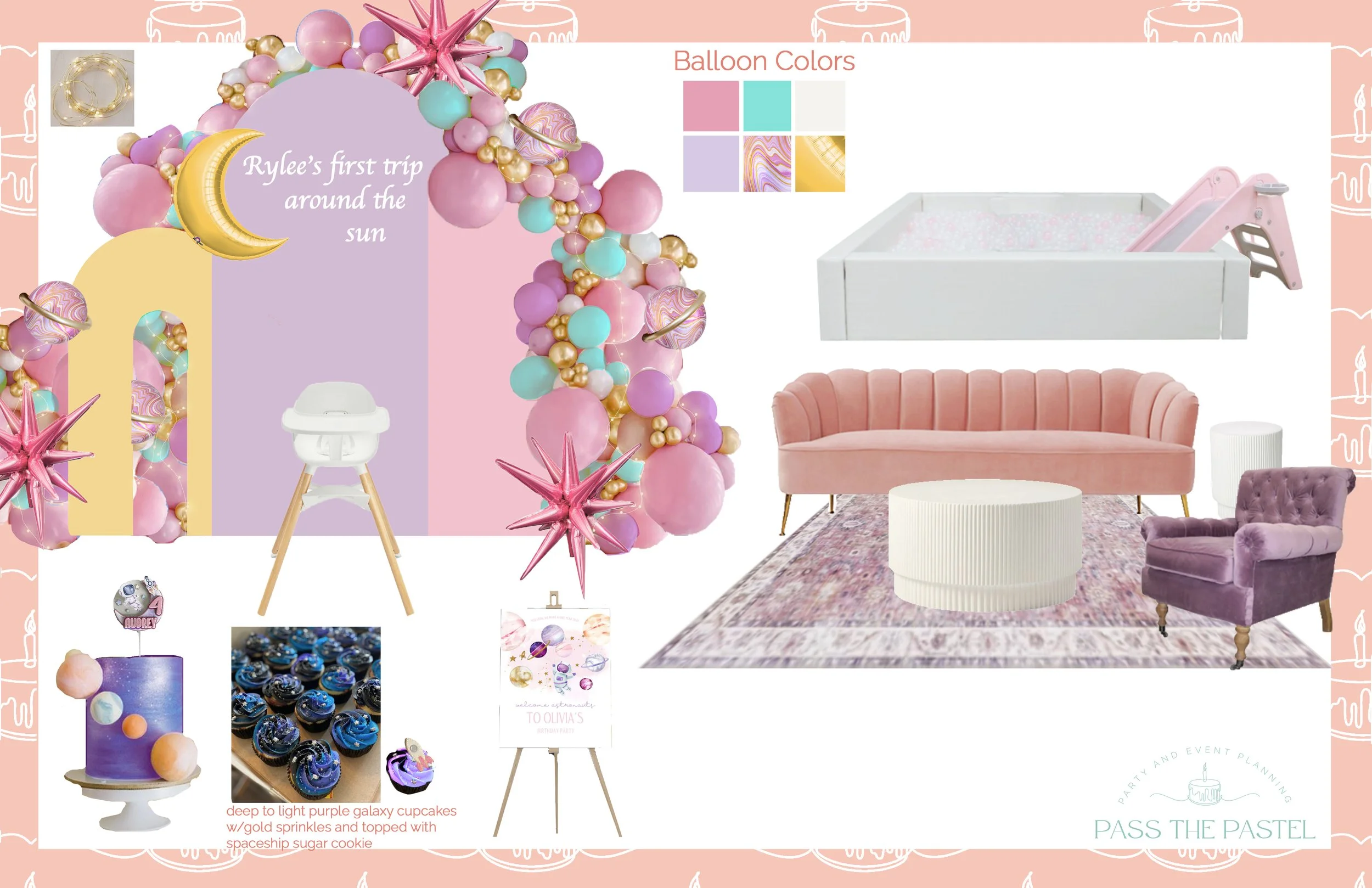
In this first pass, I focused more on a girlier space theme with pink & purple pastels as well as gold accents. I also put some emphasis on a seating area for the adults.
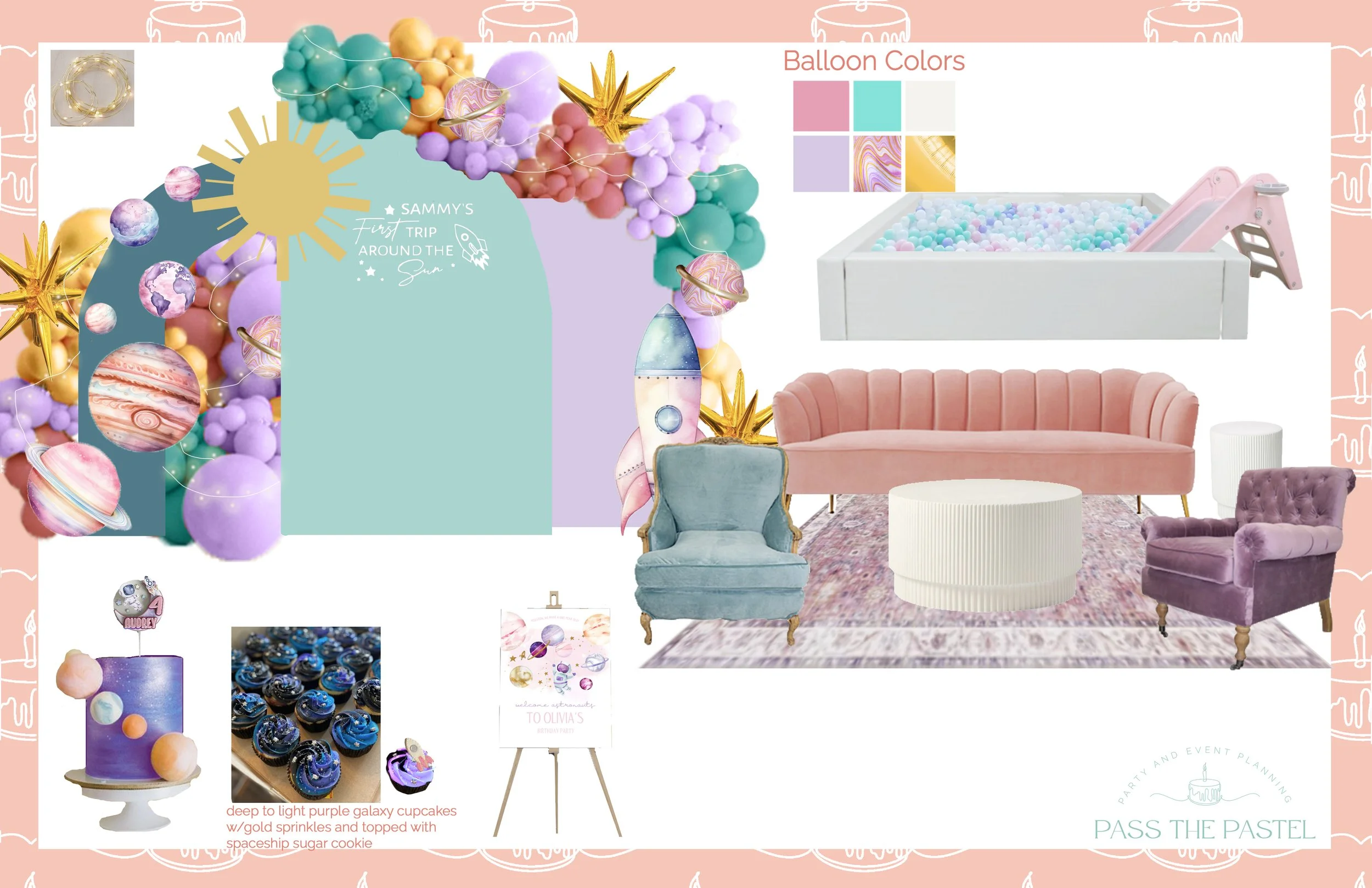
On this pass, the client and I discussed toning down the girly colors and playing with more teal, as well as adding more planetary elements in the design.

In our final iteration, we removed the seating area (decided it wasn’t needed!), adjusted the colors to have a mix of a girlier purple but mixed with other colors such as mint green and coral, and added custom illustrations of Rylee as an astronaut, her dog Momo and a rocket ship.

And here was the final! We both absolutely loved how it turned out and the deep violet color for the backdrop, covered in stars, was the right call!
Next, we have some evolutions of the Baby in Bloom baby shower I planned earlier this year! You’ll see in these examples how the later mockups get more detailed. This is because as I get more into the weeds, I generally gather more details and information that help inform the design.

In the first iteration, we had discussed minimal balloons and florals to save on budget, as well as including the sage green as more of a focal accent. Using the sage green in the backdrop and welcome sign was a simple way to tie it all together.

In the next iteration, we did away with the sage green backdrop as it was a bit too distracting and replaced it with peachier colors. However, this version was now starting to lack the sage green a bit too much.

In our final iteration, we decided to meet in the middle with the pinks and peaches for the backdrop, make the balloon garland a full one and incorporate green there, as well as add a green tablecloth and pink table runner. This one felt complete and right! With that, we were ready to move onto the event.

The final result! It looked even more gorgeous in person, like a true garden party!
Today’s last example is a few different iterations of a classy disco themed birthday party. The client specifically asked for more golds and silvers rather than true disco.

The first iteration incorporated a mix of gold, cream and rose gold.


These iterations both added black to bring a little more class, but one had the rose gold and gold, while the other substituted silver for the rose gold.

In our final iteration, the client decided she liked the silver better than the rose gold. Additionally, we removed all traces of black as it ended up being a bit too harsh (as well as being a sign of bad luck in their culture - don’t want that!)

Here was the final result! With a few tweaks (changing the gold tablecloth for white and not carrying balloons across the top of the backdrop), it was complete. The client and I both loved how this one turned out! Of course, there were disco balls at the bottom of the table as well, as seen in the mockup (not pictured here).
Design is definitely one of my favorite aspects of event planning. Seeing it all come to life is the next best part! If you need help designing a party of your own, don’t hesitate to reach out. I’m just an email away. ;)